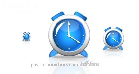
photoshop圖標制作:時鐘
時間:2024-02-05 06:00作者:下載吧人氣:31
作者fairy_huang 出處:Iconfans
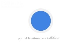
Step1 步驟1
We'll begin this tutorial, by creating a new canvas at a size of 283 x 152 then select the "Elipse Tool".
photoshop教程開始,從創(chuàng)建新文檔開始,創(chuàng)建一個大小為283 x 152像素的新文檔,然后選擇“橢圓工具”
Draw a circle as illustrated using f1f1f1 as the color. Name this layer "Gray Circle".
畫一個正圓(fairy插嘴:按住SHIFT可以創(chuàng)建正圓哦~),填充淺灰色,色值為“f1f1f1",將這個圖層命名為”灰色正圓“(這個翻譯得不太準,大家按照自己的喜好對圖層命名好了)
Step2 步驟2
Using the "Elipse Tool" once again draw a circle this time using 3f84e2 as the color. Name this layer "Blue Circle".
使用橢圓工具再畫一個正圓,這次使用的填充顏色是藍色咯,色值為”3f84e2"。同樣的,將這個圖層也進行命名。(我這里就直譯了哈,叫做“藍色正圓”)另外,fairy又要插嘴了,我是想告訴大家,這個藍色圓和之前的灰色圓,圓心要重合哦~我的做法是直接復制了灰色圓,然后CTRL+T等比例縮放了一下……
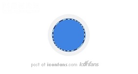
Step3 步驟3
Now"Ctrl" click the "Blue Circle" layer to create a selection around itand go to "Selection" then "Modify" and lastly "Contract" by 1.
現(xiàn)在我們載入圖層2(就是那個藍色正圓的圖層)選區(qū)(具體方法是按住CTRL鍵點擊需要載入選區(qū)的圖層),然后在頂部菜單里點“選擇”= “修改”= “收縮”,收縮量為1像素。
Step4 步驟4
Nowgo back to the "Grey Circle" layer and rasterize it by going to themain menu and selecting "Layer" then "Rasterize" and lastly "Shape".
在載入選區(qū)的狀態(tài)下回到最初創(chuàng)建的那個圖層,就是“灰色正圓”那個啦,在主菜單上點“圖層”--“柵格化”--“形狀”。
Next go to "Edit" and lastly "Cut" to rid the center of the "Grey Circle".
下一步到編輯菜單,最后選擇“清除”,以消除中間部分的灰色圓。
Drag the "Blue Circle" so it is beneath the "Grey Circle" in the Layers Palette.
現(xiàn)在可以取消選區(qū)啦(快捷鍵CTRL+D),把之前的那個“藍色正圓”的圖層拖到“灰色圖層”的下面。(嘻嘻……看到了吧,這樣的話,時鐘的外圈和內(nèi)里就做出來了,下面繼續(xù)細化)
Step5 步驟5
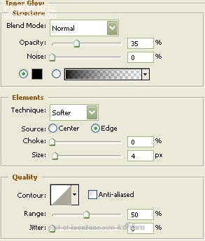
Now right click the "Grey Circle" layer and select, "Blending Options...". Now click on "Inner Glow".
現(xiàn)在雙擊“灰色正圓”圖層,開始設置圖層樣式,首先是“內(nèi)發(fā)光”。參數(shù)如下圖所示:
Step6 步驟6
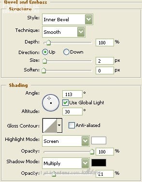
Now click on "Bevel and Emboss".
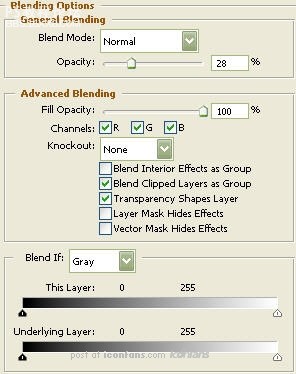
繼續(xù)設計圖層樣式,選擇“斜面和浮雕”,參數(shù)參照下圖(這里的inner bevel是內(nèi)斜面,screen和multiply分別是“濾色”和“正片疊底”):
Step7 步驟7
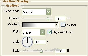
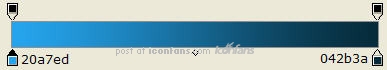
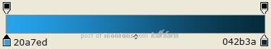
Now click on "Gradient Overlay".設置“漸變疊加”,如圖:
Step8 步驟8
漸變疊加的各色標色值如圖:

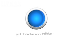
Step9 步驟9
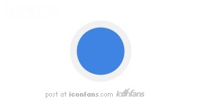
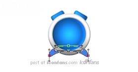
You should now have the below image.
現(xiàn)在呢,你應該能得到下圖效果了~
, Step10 步驟10
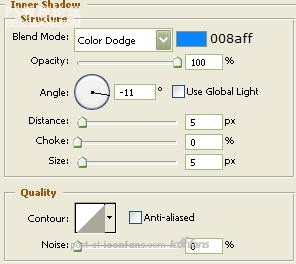
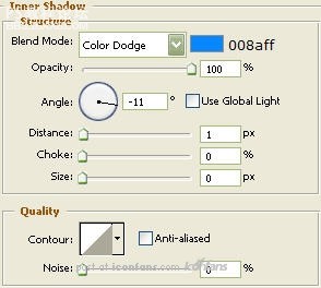
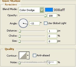
Now right click the "Blue Circle" layer and select, "Blending Options...". Now click on "Inner Shadow".
現(xiàn)在來給“藍色正圓”設置圖層樣式,依然是雙擊圖層彈出圖層樣式設置,我們先來設置“內(nèi)陰影”。參數(shù)參考下圖(在這里,Color Dodge是“顏色減淡”):
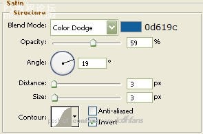
Step11 步驟11
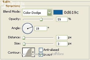
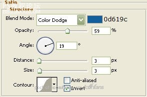
Now click on "Satin".現(xiàn)在設置“光澤”,參數(shù)調(diào)整如下圖:
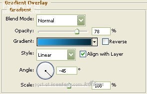
Step12 步驟12
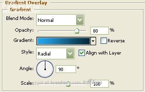
Now click on "Gradient Overlay".這里又要設置“漸變疊加”了哦,參數(shù)如圖:
Step13 步驟13
漸變疊加中,色標的色值如下圖:
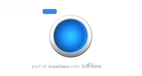
Step14 步驟14
You should now have the below image.做完以上這些設置之后,你現(xiàn)在應該得到下圖所示效果了^_^
Step15 步驟15
Now select the "Rounded Rectangle Tool".
現(xiàn)在選擇“圓角矩形工具”
Draw a rectangle as illustrated below with a radius of 3 pixels using the color 3f84e2. Name this layer "Bell".
畫一個半徑為3像素的圓角矩形,顏色色值為“3f84e2",命名這個圖層為“鈴”。(fairy插嘴:這個圖層就是時鐘頂部的兩個小耳朵的雛形啦,所以大小大家要自己衡量一下哦~)
Step16 步驟16
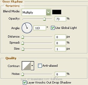
Now right click the "Bell" layer and select, "Blending Options...". Now click on "Drop Shadow".
現(xiàn)在我們要給這個“鈴”的圖層設置圖層樣式啦~,首先設置“投影”,參數(shù)參考下圖:
Step17 步驟17
Now click on "Inner Shadow".現(xiàn)在設置一下“內(nèi)陰影”,參數(shù)如圖:
Step18 步驟18
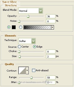
Now click on "Inner Glow".繼續(xù)圖層樣式的設置,現(xiàn)在是“內(nèi)發(fā)光”,參數(shù)如圖:
Step19 步驟19
Now click on "Satin".現(xiàn)在點擊“光澤”來繼續(xù)設置,如圖:
, Step20 步驟20
Now click on "Gradient Overlay".設置“漸變疊加”,如圖:
Step21 步驟21 漸變疊加各色標的色值和位置如下圖:
Step22 步驟22
You should now have the below image.
現(xiàn)在,我們會得到下圖所示效果啦

Step23 步驟23
Asyou can see, I have two bells and they are angled. To angle the "Bell"layer, go to the main menu and choose "Edit" then "Free Transform".While holding in the "Shift" key on your keyboard, rotate the "Bell"layer till it reaches -30 degrees in the options palette.
正如你所見,我們的時鐘通常都有兩個“鈴”的,并且是都有所傾斜的在時鐘頂部。那么,我們現(xiàn)在回到“鈴”那個圖層,從主菜單上選擇“編輯”--“自由變換”(其實這里CTRL+T就可以)。然后呢,按住Shift鍵旋轉(zhuǎn)這個層,直到你看到面板上(就是最頂部那一行的),顯示角度為“-30度”。
Duplicate the "Bell" layer then go to the main menu and select "Edit" then "Transform" and lastly "Flip Horizontally".
復制“鈴”這個圖層,CTRL+T,單擊右鍵,選擇“水平翻轉(zhuǎn)”。(這里我沒有按照原文翻譯,因為覺得快捷鍵來得更省事一些)
Move to it's appropriate spot and place beneath the "Grey Circle" layer in the layer palette.
將水平翻轉(zhuǎn)過后的“鈴”和之前的“鈴”移動到合適的位置,當然,這兩個層需要在“灰色正圓”的圖層之下哦~

Step24 步驟24
Thenselect the "Elipse Tool". Draw a circle as illustrated using 3f84e2 asthe color. Name this layer "Clock Legs". Place beneath the "GreyCircle" layer in the layer palette.
選擇“橢圓工具”,畫一個比較扁一些的橢圓,顏色使用色值為“3f84e2",將這個圖層命名為“時鐘腿”,這個圖層是要放在“灰色正圓圖層”下面的哦~
Nextwe will need to move the bottom anchor point of the "Clock Legs" layer.To do this select the "Direct Selection Tool"and select the bottomanchor point as I have done below. Now, using the up arrow key and"Shift" key on your keyboard, move that anchor point up three times asillustrated below. Then move the outside anchor points in once whileholding in the "Shift" key as well.
下面我們需要調(diào)整這個“時鐘腿”的錨點,使最初的橢圓形狀變?yōu)闀r鐘腿的模樣。
Step25
步驟25
Now right click the "Clock Legs" layer and select, "Blending Options...". Now click on "Drop Shadow".
現(xiàn)在來對“時鐘腿”設置圖層樣式,先設置“投影”,參數(shù)如圖。
Step26 步驟26
Now click on "Inner Shadow".現(xiàn)在點擊“內(nèi)陰影”進行設置,參數(shù)如圖:
Step27 步驟27
Now click on "Inner Glow".點擊“內(nèi)發(fā)光”,參數(shù)如圖:
Step28 步驟28
Now click on "Satin".現(xiàn)在設置“光澤”,參數(shù)如圖:
, Step29 步驟29
You should now have the below image.做完以上設置以后,你應該就能得到下圖所示效果了^_^

Step30 步驟30
Nowselect the "Pen Tool" and draw the hands of the clock. For thoseunfamiliar with the "Pen Tool" you may download the custom shape herethat I made for you. For those of you who are taking the time creatingthem yourself, when satisfied, merge the hands together so the handsare on one layer.
現(xiàn)在使用“鋼筆工具”把時鐘的表針畫出來,對于不太熟悉鋼筆工具的人,我準備了“表針形狀”可供下載使用。http://www.empiredezign.com/vers ... romempiredezign.csh"target="_blank" “點擊這里”下載表針形狀
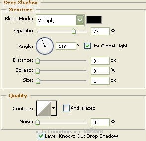
Then give it a "Drop Shadow" byright clicking the merged clock peices layer and selecting, "BlendingOptions...". Now click on "Drop Shadow". Settings for that are: Angle:113 Distance:1 Size: 2
做完表針以后,記得把表針放到時鐘的中心位置,然后加上一個圖層樣式“投影”,參數(shù)為:角度:113,距離:1,大小:2

Step31 步驟31
Then select the "Elipse Tool". Draw a circle as illustrated using Black as the color. Name this layer "Shadow".
現(xiàn)在選擇“橢圓工具”,用黑色畫一個扁扁的橢圓,命名這個圖層為“時鐘投影”
Place beneath the "Clock Legs" layer in the layer palette.
把這個層放到所有圖層的下面。(它可是時鐘的投影耶,大家畫的時候注意大小哦)

Step32 步驟32
Now right click the "Clock Legs" layer and select, "Blending Options...".現(xiàn)在雙擊“時鐘腿”圖層設置圖層樣式,如圖:
Step33 步驟33
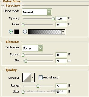
Now click on "Outer Glow".點擊“外發(fā)光”,參數(shù)如圖:
Step34 步驟34
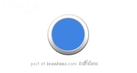
You should now have the below image.做完以上設置后,你應該就能得到下圖所示效果了:

Step35 步驟35
The Results!!!最終結(jié)果~!!!

I'veadded some gloss to the face of the clock to give it a bitmore life.Todo this, I used the "Elipse Tool" with White as the color. I thenturned the Fill down. The curved glossy part, I used the "Pen Tool" andthat's it. I hope you enjoyed this tutorial.
我最后添加了一些高光,(大家自己也嘗試添加一下吧),我使用到了“橢圓工具”和“鋼筆工具”……教程結(jié)束,希望大家喜歡^_^(fairy插嘴,大家最后最好對自己的圖圖進行一定調(diào)整,比如陰影部分的透明度啦,模糊啦什么的,希望大家都能做出自己最滿意的作業(yè)~!謝謝)
Step1 步驟1
We'll begin this tutorial, by creating a new canvas at a size of 283 x 152 then select the "Elipse Tool".
photoshop教程開始,從創(chuàng)建新文檔開始,創(chuàng)建一個大小為283 x 152像素的新文檔,然后選擇“橢圓工具”
Draw a circle as illustrated using f1f1f1 as the color. Name this layer "Gray Circle".
畫一個正圓(fairy插嘴:按住SHIFT可以創(chuàng)建正圓哦~),填充淺灰色,色值為“f1f1f1",將這個圖層命名為”灰色正圓“(這個翻譯得不太準,大家按照自己的喜好對圖層命名好了)
Step2 步驟2
Using the "Elipse Tool" once again draw a circle this time using 3f84e2 as the color. Name this layer "Blue Circle".
使用橢圓工具再畫一個正圓,這次使用的填充顏色是藍色咯,色值為”3f84e2"。同樣的,將這個圖層也進行命名。(我這里就直譯了哈,叫做“藍色正圓”)另外,fairy又要插嘴了,我是想告訴大家,這個藍色圓和之前的灰色圓,圓心要重合哦~我的做法是直接復制了灰色圓,然后CTRL+T等比例縮放了一下……
Step3 步驟3
Now"Ctrl" click the "Blue Circle" layer to create a selection around itand go to "Selection" then "Modify" and lastly "Contract" by 1.
現(xiàn)在我們載入圖層2(就是那個藍色正圓的圖層)選區(qū)(具體方法是按住CTRL鍵點擊需要載入選區(qū)的圖層),然后在頂部菜單里點“選擇”= “修改”= “收縮”,收縮量為1像素。
Step4 步驟4
Nowgo back to the "Grey Circle" layer and rasterize it by going to themain menu and selecting "Layer" then "Rasterize" and lastly "Shape".
在載入選區(qū)的狀態(tài)下回到最初創(chuàng)建的那個圖層,就是“灰色正圓”那個啦,在主菜單上點“圖層”--“柵格化”--“形狀”。
Next go to "Edit" and lastly "Cut" to rid the center of the "Grey Circle".
下一步到編輯菜單,最后選擇“清除”,以消除中間部分的灰色圓。
Drag the "Blue Circle" so it is beneath the "Grey Circle" in the Layers Palette.
現(xiàn)在可以取消選區(qū)啦(快捷鍵CTRL+D),把之前的那個“藍色正圓”的圖層拖到“灰色圖層”的下面。(嘻嘻……看到了吧,這樣的話,時鐘的外圈和內(nèi)里就做出來了,下面繼續(xù)細化)
Step5 步驟5
Now right click the "Grey Circle" layer and select, "Blending Options...". Now click on "Inner Glow".
現(xiàn)在雙擊“灰色正圓”圖層,開始設置圖層樣式,首先是“內(nèi)發(fā)光”。參數(shù)如下圖所示:
Step6 步驟6
Now click on "Bevel and Emboss".
繼續(xù)設計圖層樣式,選擇“斜面和浮雕”,參數(shù)參照下圖(這里的inner bevel是內(nèi)斜面,screen和multiply分別是“濾色”和“正片疊底”):
Step7 步驟7
Now click on "Gradient Overlay".設置“漸變疊加”,如圖:
Step8 步驟8
漸變疊加的各色標色值如圖:
Step9 步驟9
You should now have the below image.
現(xiàn)在呢,你應該能得到下圖效果了~
, Step10 步驟10
Now right click the "Blue Circle" layer and select, "Blending Options...". Now click on "Inner Shadow".
現(xiàn)在來給“藍色正圓”設置圖層樣式,依然是雙擊圖層彈出圖層樣式設置,我們先來設置“內(nèi)陰影”。參數(shù)參考下圖(在這里,Color Dodge是“顏色減淡”):
Step11 步驟11
Now click on "Satin".現(xiàn)在設置“光澤”,參數(shù)調(diào)整如下圖:
Step12 步驟12
Now click on "Gradient Overlay".這里又要設置“漸變疊加”了哦,參數(shù)如圖:
Step13 步驟13
漸變疊加中,色標的色值如下圖:
Step14 步驟14
You should now have the below image.做完以上這些設置之后,你現(xiàn)在應該得到下圖所示效果了^_^
Step15 步驟15
Now select the "Rounded Rectangle Tool".
現(xiàn)在選擇“圓角矩形工具”
Draw a rectangle as illustrated below with a radius of 3 pixels using the color 3f84e2. Name this layer "Bell".
畫一個半徑為3像素的圓角矩形,顏色色值為“3f84e2",命名這個圖層為“鈴”。(fairy插嘴:這個圖層就是時鐘頂部的兩個小耳朵的雛形啦,所以大小大家要自己衡量一下哦~)
Step16 步驟16
Now right click the "Bell" layer and select, "Blending Options...". Now click on "Drop Shadow".
現(xiàn)在我們要給這個“鈴”的圖層設置圖層樣式啦~,首先設置“投影”,參數(shù)參考下圖:
Step17 步驟17
Now click on "Inner Shadow".現(xiàn)在設置一下“內(nèi)陰影”,參數(shù)如圖:
Step18 步驟18
Now click on "Inner Glow".繼續(xù)圖層樣式的設置,現(xiàn)在是“內(nèi)發(fā)光”,參數(shù)如圖:
Step19 步驟19
Now click on "Satin".現(xiàn)在點擊“光澤”來繼續(xù)設置,如圖:
, Step20 步驟20
Now click on "Gradient Overlay".設置“漸變疊加”,如圖:
Step21 步驟21 漸變疊加各色標的色值和位置如下圖:
Step22 步驟22
You should now have the below image.
現(xiàn)在,我們會得到下圖所示效果啦
Step23 步驟23
Asyou can see, I have two bells and they are angled. To angle the "Bell"layer, go to the main menu and choose "Edit" then "Free Transform".While holding in the "Shift" key on your keyboard, rotate the "Bell"layer till it reaches -30 degrees in the options palette.
正如你所見,我們的時鐘通常都有兩個“鈴”的,并且是都有所傾斜的在時鐘頂部。那么,我們現(xiàn)在回到“鈴”那個圖層,從主菜單上選擇“編輯”--“自由變換”(其實這里CTRL+T就可以)。然后呢,按住Shift鍵旋轉(zhuǎn)這個層,直到你看到面板上(就是最頂部那一行的),顯示角度為“-30度”。
Duplicate the "Bell" layer then go to the main menu and select "Edit" then "Transform" and lastly "Flip Horizontally".
復制“鈴”這個圖層,CTRL+T,單擊右鍵,選擇“水平翻轉(zhuǎn)”。(這里我沒有按照原文翻譯,因為覺得快捷鍵來得更省事一些)
Move to it's appropriate spot and place beneath the "Grey Circle" layer in the layer palette.
將水平翻轉(zhuǎn)過后的“鈴”和之前的“鈴”移動到合適的位置,當然,這兩個層需要在“灰色正圓”的圖層之下哦~
Step24 步驟24
Thenselect the "Elipse Tool". Draw a circle as illustrated using 3f84e2 asthe color. Name this layer "Clock Legs". Place beneath the "GreyCircle" layer in the layer palette.
選擇“橢圓工具”,畫一個比較扁一些的橢圓,顏色使用色值為“3f84e2",將這個圖層命名為“時鐘腿”,這個圖層是要放在“灰色正圓圖層”下面的哦~
Nextwe will need to move the bottom anchor point of the "Clock Legs" layer.To do this select the "Direct Selection Tool"and select the bottomanchor point as I have done below. Now, using the up arrow key and"Shift" key on your keyboard, move that anchor point up three times asillustrated below. Then move the outside anchor points in once whileholding in the "Shift" key as well.
下面我們需要調(diào)整這個“時鐘腿”的錨點,使最初的橢圓形狀變?yōu)闀r鐘腿的模樣。
Step25
步驟25
Now right click the "Clock Legs" layer and select, "Blending Options...". Now click on "Drop Shadow".
現(xiàn)在來對“時鐘腿”設置圖層樣式,先設置“投影”,參數(shù)如圖。
Step26 步驟26
Now click on "Inner Shadow".現(xiàn)在點擊“內(nèi)陰影”進行設置,參數(shù)如圖:
Step27 步驟27
Now click on "Inner Glow".點擊“內(nèi)發(fā)光”,參數(shù)如圖:
Step28 步驟28
Now click on "Satin".現(xiàn)在設置“光澤”,參數(shù)如圖:
, Step29 步驟29
You should now have the below image.做完以上設置以后,你應該就能得到下圖所示效果了^_^
Step30 步驟30
Nowselect the "Pen Tool" and draw the hands of the clock. For thoseunfamiliar with the "Pen Tool" you may download the custom shape herethat I made for you. For those of you who are taking the time creatingthem yourself, when satisfied, merge the hands together so the handsare on one layer.
現(xiàn)在使用“鋼筆工具”把時鐘的表針畫出來,對于不太熟悉鋼筆工具的人,我準備了“表針形狀”可供下載使用。http://www.empiredezign.com/vers ... romempiredezign.csh"target="_blank" “點擊這里”下載表針形狀
Then give it a "Drop Shadow" byright clicking the merged clock peices layer and selecting, "BlendingOptions...". Now click on "Drop Shadow". Settings for that are: Angle:113 Distance:1 Size: 2
做完表針以后,記得把表針放到時鐘的中心位置,然后加上一個圖層樣式“投影”,參數(shù)為:角度:113,距離:1,大小:2
Step31 步驟31
Then select the "Elipse Tool". Draw a circle as illustrated using Black as the color. Name this layer "Shadow".
現(xiàn)在選擇“橢圓工具”,用黑色畫一個扁扁的橢圓,命名這個圖層為“時鐘投影”
Place beneath the "Clock Legs" layer in the layer palette.
把這個層放到所有圖層的下面。(它可是時鐘的投影耶,大家畫的時候注意大小哦)
Step32 步驟32
Now right click the "Clock Legs" layer and select, "Blending Options...".現(xiàn)在雙擊“時鐘腿”圖層設置圖層樣式,如圖:
Step33 步驟33
Now click on "Outer Glow".點擊“外發(fā)光”,參數(shù)如圖:
Step34 步驟34
You should now have the below image.做完以上設置后,你應該就能得到下圖所示效果了:
Step35 步驟35
The Results!!!最終結(jié)果~!!!
I'veadded some gloss to the face of the clock to give it a bitmore life.Todo this, I used the "Elipse Tool" with White as the color. I thenturned the Fill down. The curved glossy part, I used the "Pen Tool" andthat's it. I hope you enjoyed this tutorial.
我最后添加了一些高光,(大家自己也嘗試添加一下吧),我使用到了“橢圓工具”和“鋼筆工具”……教程結(jié)束,希望大家喜歡^_^(fairy插嘴,大家最后最好對自己的圖圖進行一定調(diào)整,比如陰影部分的透明度啦,模糊啦什么的,希望大家都能做出自己最滿意的作業(yè)~!謝謝)
標簽時鐘,制作,圖標,photoshop

網(wǎng)友評論