photoshop制作logo教程:鋼盔
時間:2024-02-05 06:00作者:下載吧人氣:30
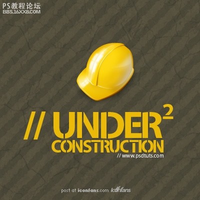
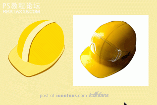
先看看效果圖:
以下是詳細的photoshop教程:
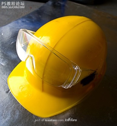
Step 1
Asa base, we will use this photograph I took. It's not the greatestphoto, but we can use it to define the basic shapes. The advantage ofthis photo is the fact that it was taken with wide-lens camera, and theperspective is nicely visible. When we talk about icons, perspective isvery often VERY excessive, so this is perfect.
第一步
我們將用我找到的這張圖作為基礎。這張圖不一定是最好的,但是我們可以用它來界定我們要做的頭盔的形狀。這張圖好在它是用廣角相機拍攝,而且透視圖非常清晰,當我們談到圖標時,透視圖是非常重要的,所以這張圖非常完美。
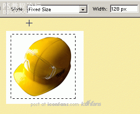
Step 2
Sofirstly, cut the helmet out of its background. You can do this usingthe Pen Tool, or your favorite way of extracting images. Then copy thisphoto into a new photoshop document and resize the image to fit theicons dimension — probably 128x128 px. You can use, for example, a newlayer sized 128x128, which will help you to be more accurate. Or youcan, of course, use document sized 128x128 px, but I like to have morespace for drawing.
第二步
首先,將頭盔從背景中摳出來,你可以用鋼筆工具來完成,或者任何你喜歡的摳圖的方法。然后拷貝這張圖到一個新的PS文檔,調整大小以適合圖標的尺寸——一般是128×128像素。
比如你可以將其新建一個圖層并將圖像調整為128×128像素,或者調整畫布大小為128×128像素,但是我比較喜歡更大的空間來繪制。
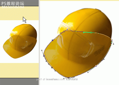
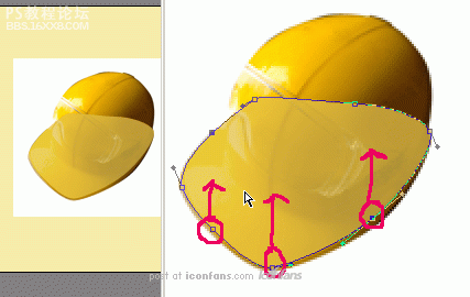
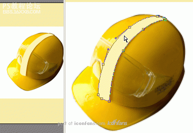
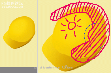
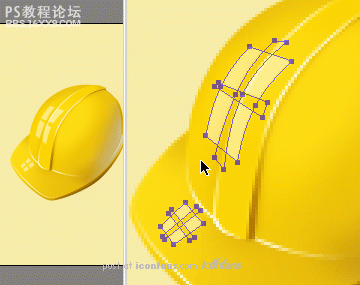
Step 3
Selectthe Pen Tool and step-by-step trace each part of the helmet. We beginwith the visor area. Don´t worry about the color, it's the shape that'simportant. For better accuracy, it's good to decrease the layer´svisibility (Opacity). Simply press the numlock key corresponding to thepercentage opacity you want &mdash for example, 5 for 50% Opacity.When tracing, be sure to draw as a Shape Layer (first icon on theOptions bar), so you can modify this layer in the future.
Notethat because we're just tracing the visor, it doesn't matter that therest isn't accurate around the helmet shape (we'll do that in the nextsteps).
第三步
選擇鋼筆工具一步一步的描出頭盔的每個部分。我們從帽舌開始,不要擔心顏色,形狀最重要。為了能更加精確,最好調整一下圖層透明度,你可以用小鍵盤來控制,舉例來說,5就是50%透明度,當你開始描的時候,確保你畫的是形狀圖層,這樣你在后面才能修改它。記住因為我們只是描的帽舌部分,所以被帽子擋住的那部分不必描那么精確。(我們在后面不會用到那部分的)
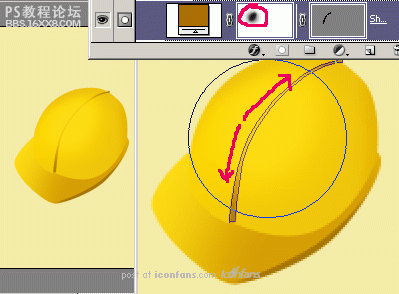
Step 4
Createthe second part of the "peak" by copying the previous layer (Ctrl + J)and move the selected points upward with the Direct Selection Tool (A).
第四步
通過復制圖層(Ctrl+J)以及使用直接選擇工具上移選擇的點來創建“尖尖”的第二部分。
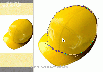
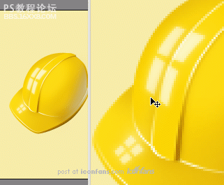
Step 5
Then trace the main part of the helmet as shown below.
第五步
然后照下面的描出鋼盔的主體部分。
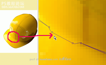
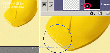
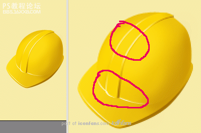
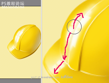
, Step 6
Don´tforget the embossed part in the middle (magnified on the nextscreenshot). You can make it purposely bigger, because the middlestreak will nicely help you to define the 3D shape of the helmet.
第六步
不要忘記中間的突起部分(旁邊的圖是放大以后的)。你可以把它做的盡可能大點,因為中間的尖尖能更好的幫你界定鋼盔的3D陰影。
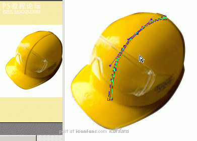
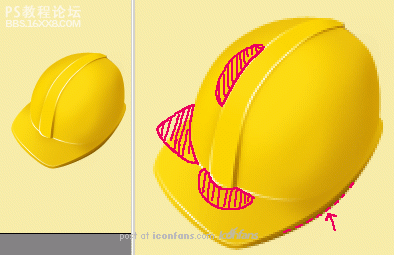
Step 7
That is why you can draw this streak as a new layer too. First, start with the right part - which is in the shadow.
第七步
這就是為什么你也能像一個新圖層一樣來畫這個尖尖。首先,從右邊的部分開始——就是陰影那部分。
Step 8
Thenduplicate this layer (Ctrl + J) and with Direct Selection Tool, movethe point on the right to the left. This way, the right side of thisshape will perfectly fit the left part of the previous layer.
第八步
然后復制這個圖層并用直接選擇工具,移動右邊的點到左邊去。這樣,形狀的右邊部分就能完美的貼合之前圖層的左邊部分。
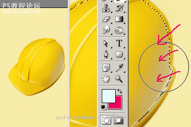
Step 9
Youare ready to go to the next level. Hide the photograph (or move it tothe side), and as you can see, the basic shape of our icon is done. Youshould now have five layers of shapes ready for the next stage. I'llrefer to them by numbering in order of how we drew them (1-5)
第九步
你準備開始進入下一階段了。隱藏原始圖片(或者把它移到旁邊去),就像你看到的那樣,我們圖標的基本形狀已經完成了。你現在應該有5個形狀圖層來準備進入下個階段。我將按照我們繪制的順序來把它命名為1-5.
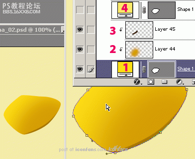
Step 10
Tostart, hide all layers except the first one (1) and fill this layerwith yellow color (#FFDF14). Then create new layer (Ctrl + Shift + Alt+ N), and group it with previous (Ctrl + Alt + G). On this screenshot,it´s layer (2). Into this layer, draw with big soft brush with darkercolor (#D59D00) so the layer will be darker on the right side. Next,load the selection of layer (4), invert the selection (Ctrl + Shift +I), create new layer (3) and again use big soft brush to draw a shadowon the right side ( #3B1C02).
第十步
作為開始,隱藏除了第一個(1)意外的所有圖層并將圖層填充為黃色(#FFDF14),然后創建一個新的圖層(Ctrl+Shift+Alt+N),并將它與前者編組(Ctrl+Alt+G),在這個截圖中,它是圖層(2),在這個圖層中,用大的軟的黑色(#D59D00)筆刷來畫出讓圖層右邊暗一些的效果,接著,選取圖層(4)的選區,反選(Ctrl+Shift+I),創建新圖層(3)并再次用大的軟的筆刷來畫出右邊的陰影(#3B1C02)。
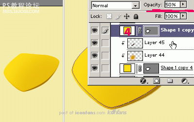
Step 11
Sothat you don´t have to do it all again for layer (4), show this layerwith decreased opacity to 50%. This way, you can still see the shadowfrom the previous layer — how easy. For now, the "peak" is done and youcan continue with the main part of the helmet.
第十一步
這樣你不用為圖層(4)都再做一遍,將此圖層的透明度調整為50%。這樣,你仍然可以從之前的圖層中看到陰影——多么簡單啊。現在為止,“尖尖”已經完成了并且你可以繼續頭盔的主體部分了。
Step 12
So,unhide the shape of main part and recolor it to the yellow (#FDDB13).Again, create a new layer, group it with previous (Ctrl + Alt + G), andin the marked areas, use big soft brush with darker color. It´s notnecessary to make a very big shadow...
第十二步
主體形狀部分取消隱藏并重新著色(#FDDB13),再一次,創建新的圖層,與前者編組,并在標記的區域用大的軟的更黑的筆刷來繪制。這里沒必要做出一個很大的陰影….
, Step 13
Fora better result, you can use the middle streak. Unhide this layer,recolor it to the dark yellow (#AA6F00), and add a layer mask. Intothis mask, draw in the middle with a big soft black brush (as shownbelow), and the layer will be visible only on the sides, not in themiddle.
第十三步
為了一個更好的效果,你可以用一個中間蒙版,取消隱藏這個圖層,用暗黃色(#AA6F00)重新著色,并添加一個圖層蒙版,在這個蒙版中,在中間用大的軟的黑色(就像下圖這樣)筆刷繪制,這樣圖層將只有邊緣可見,中間不可見。
Step 14
Next,unhide the last layer, the main part of the streak. Recolor it toyellow (#FBD500). In this step, you can also darken the main part ofthe helmet to match the peak.
第十四步
接著,取消隱藏最后的圖層,條紋的主體部分。用黃色重新著色(#FBD500)。在這一步,你依然可以調暗鋼盔的主體部分來配合條紋。
Step 15
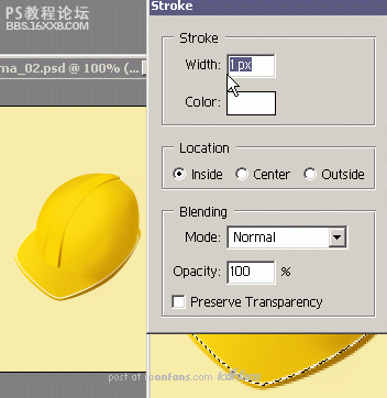
Tomake the shape of the helmet more accentuated, use this simple method:draw a one-pixel outline around every shape where the light shines.
Startwith second peak layer. Load the selection (Ctrl-click on the layer),create new layer, and from the Edit menu select the Stroke function.Set the Width to 1px, color white.
第十五步
為了讓頭盔的陰影更突出,用這個簡單的工具:在每個形狀的邊緣被光照到的地方畫一個1像素的白線。從第二個尖圖層開始,讀取選取(Ctrl+點擊圖層),創建新圖層,從編輯菜單中選擇描邊功能,設置寬為1像素,白色。
Step 16
Adda layer mask to this layer and fill it with black color. This waynothing is visible. Then select a big soft white brush and draw intothe mask where the light should shine. The outline will be visible onlywhere the white area is in the mask.
第十六步
添加一個圖層蒙版并填充為黑色。這樣任何東西都不可見。然后選擇一個大的軟的白色筆刷在光線會照到的地方對應的蒙版位置繪制一小片白色。只有蒙版上的白色區域會讓輪廓可見。
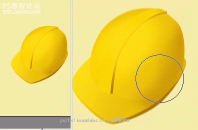
Step 17
Use the same method for the other shapes. The icon is really starting to take shape now!
第十七步
用同樣的方法來對付其他的部分,圖標開始真的出現立體感了!
Step 18
Continue with another darkening in selected areas (shown) where the contrast between the helmet parts is too low.
第十八步
在下面標記的對比度太低的頭盔部分繼續調整。
, Step 19
Tomake the icon even better, you can add backlight with another color.This will help a lot because icons with only one color tend to look alittle dull.
Firstly, load the selection of all shape layers(Ctrl + Shift – click on the layers), create new layer, contract theselection of 1 pixel (Select Modify Contract), and use a bigsoft brush to draw the backlight, as the arrow shows. Use whatevercolor you like, light blue or violet work well.
第十九步
為了讓圖標更好看,你可以用另外一個顏色添加一個背光。這將很有效果因為圖標只有一個顏色將看起來比較不鮮明。
首先,選擇所有形狀圖層的選區(Ctrl+Shift+點擊所有圖層),創建新圖層,縮小選區1像素(選擇 修改 收縮),并用大軟筆刷來畫背光,就像箭頭所示,用任何你喜歡的顏色,亮藍或紫羅蘭效果很好。
Step 20
Thelast thing you will be adding is the very big highlight. As in thetutorial iMouse — Creating an Apple Mouse (which I also wrote!), startwith Pen Tool and draw the window shapes:
第二十步
最后的事情就是添加大型高光。照圖做吧,用鋼筆畫出窗戶的形狀開始。(原作者說的是他之前在另外一個教程講過方法,所以這里大家各自發揮想象力,或者照著圖里面的做,依葫蘆畫勺吧)
Step 21
Copy this layer (Ctrl + J) and blur it with Gaussian Blur filter (set the Radius to some low number).
第二十一步
復制圖層并高斯模糊(數值低一點)
Step 22
Nowdraw with big soft white Brush over the highlights, to make it evenmore shiny. Don´t worry about the window shapes, it´s not necessary tosee them completely.
第二十二步
現在用大軟白筆刷來覆蓋高光,這樣看起來會更反光。不要擔心窗戶的形狀,不可能看的那么完整。
Step 23
And that´s it!
第二十三步
完成!!!

Asyou can see in this picture, the helmet is more outstanding on the darkbackground, so don´t be afraid to experiment and try to create iconsfrom different photographs. Good luck with your work!
以下是詳細的photoshop教程:
Step 1
Asa base, we will use this photograph I took. It's not the greatestphoto, but we can use it to define the basic shapes. The advantage ofthis photo is the fact that it was taken with wide-lens camera, and theperspective is nicely visible. When we talk about icons, perspective isvery often VERY excessive, so this is perfect.
第一步
我們將用我找到的這張圖作為基礎。這張圖不一定是最好的,但是我們可以用它來界定我們要做的頭盔的形狀。這張圖好在它是用廣角相機拍攝,而且透視圖非常清晰,當我們談到圖標時,透視圖是非常重要的,所以這張圖非常完美。
Step 2
Sofirstly, cut the helmet out of its background. You can do this usingthe Pen Tool, or your favorite way of extracting images. Then copy thisphoto into a new photoshop document and resize the image to fit theicons dimension — probably 128x128 px. You can use, for example, a newlayer sized 128x128, which will help you to be more accurate. Or youcan, of course, use document sized 128x128 px, but I like to have morespace for drawing.
第二步
首先,將頭盔從背景中摳出來,你可以用鋼筆工具來完成,或者任何你喜歡的摳圖的方法。然后拷貝這張圖到一個新的PS文檔,調整大小以適合圖標的尺寸——一般是128×128像素。
比如你可以將其新建一個圖層并將圖像調整為128×128像素,或者調整畫布大小為128×128像素,但是我比較喜歡更大的空間來繪制。
Step 3
Selectthe Pen Tool and step-by-step trace each part of the helmet. We beginwith the visor area. Don´t worry about the color, it's the shape that'simportant. For better accuracy, it's good to decrease the layer´svisibility (Opacity). Simply press the numlock key corresponding to thepercentage opacity you want &mdash for example, 5 for 50% Opacity.When tracing, be sure to draw as a Shape Layer (first icon on theOptions bar), so you can modify this layer in the future.
Notethat because we're just tracing the visor, it doesn't matter that therest isn't accurate around the helmet shape (we'll do that in the nextsteps).
第三步
選擇鋼筆工具一步一步的描出頭盔的每個部分。我們從帽舌開始,不要擔心顏色,形狀最重要。為了能更加精確,最好調整一下圖層透明度,你可以用小鍵盤來控制,舉例來說,5就是50%透明度,當你開始描的時候,確保你畫的是形狀圖層,這樣你在后面才能修改它。記住因為我們只是描的帽舌部分,所以被帽子擋住的那部分不必描那么精確。(我們在后面不會用到那部分的)
Step 4
Createthe second part of the "peak" by copying the previous layer (Ctrl + J)and move the selected points upward with the Direct Selection Tool (A).
第四步
通過復制圖層(Ctrl+J)以及使用直接選擇工具上移選擇的點來創建“尖尖”的第二部分。
Step 5
Then trace the main part of the helmet as shown below.
第五步
然后照下面的描出鋼盔的主體部分。
, Step 6
Don´tforget the embossed part in the middle (magnified on the nextscreenshot). You can make it purposely bigger, because the middlestreak will nicely help you to define the 3D shape of the helmet.
第六步
不要忘記中間的突起部分(旁邊的圖是放大以后的)。你可以把它做的盡可能大點,因為中間的尖尖能更好的幫你界定鋼盔的3D陰影。
Step 7
That is why you can draw this streak as a new layer too. First, start with the right part - which is in the shadow.
第七步
這就是為什么你也能像一個新圖層一樣來畫這個尖尖。首先,從右邊的部分開始——就是陰影那部分。
Step 8
Thenduplicate this layer (Ctrl + J) and with Direct Selection Tool, movethe point on the right to the left. This way, the right side of thisshape will perfectly fit the left part of the previous layer.
第八步
然后復制這個圖層并用直接選擇工具,移動右邊的點到左邊去。這樣,形狀的右邊部分就能完美的貼合之前圖層的左邊部分。
Step 9
Youare ready to go to the next level. Hide the photograph (or move it tothe side), and as you can see, the basic shape of our icon is done. Youshould now have five layers of shapes ready for the next stage. I'llrefer to them by numbering in order of how we drew them (1-5)
第九步
你準備開始進入下一階段了。隱藏原始圖片(或者把它移到旁邊去),就像你看到的那樣,我們圖標的基本形狀已經完成了。你現在應該有5個形狀圖層來準備進入下個階段。我將按照我們繪制的順序來把它命名為1-5.
Step 10
Tostart, hide all layers except the first one (1) and fill this layerwith yellow color (#FFDF14). Then create new layer (Ctrl + Shift + Alt+ N), and group it with previous (Ctrl + Alt + G). On this screenshot,it´s layer (2). Into this layer, draw with big soft brush with darkercolor (#D59D00) so the layer will be darker on the right side. Next,load the selection of layer (4), invert the selection (Ctrl + Shift +I), create new layer (3) and again use big soft brush to draw a shadowon the right side ( #3B1C02).
第十步
作為開始,隱藏除了第一個(1)意外的所有圖層并將圖層填充為黃色(#FFDF14),然后創建一個新的圖層(Ctrl+Shift+Alt+N),并將它與前者編組(Ctrl+Alt+G),在這個截圖中,它是圖層(2),在這個圖層中,用大的軟的黑色(#D59D00)筆刷來畫出讓圖層右邊暗一些的效果,接著,選取圖層(4)的選區,反選(Ctrl+Shift+I),創建新圖層(3)并再次用大的軟的筆刷來畫出右邊的陰影(#3B1C02)。
Step 11
Sothat you don´t have to do it all again for layer (4), show this layerwith decreased opacity to 50%. This way, you can still see the shadowfrom the previous layer — how easy. For now, the "peak" is done and youcan continue with the main part of the helmet.
第十一步
這樣你不用為圖層(4)都再做一遍,將此圖層的透明度調整為50%。這樣,你仍然可以從之前的圖層中看到陰影——多么簡單啊。現在為止,“尖尖”已經完成了并且你可以繼續頭盔的主體部分了。
Step 12
So,unhide the shape of main part and recolor it to the yellow (#FDDB13).Again, create a new layer, group it with previous (Ctrl + Alt + G), andin the marked areas, use big soft brush with darker color. It´s notnecessary to make a very big shadow...
第十二步
主體形狀部分取消隱藏并重新著色(#FDDB13),再一次,創建新的圖層,與前者編組,并在標記的區域用大的軟的更黑的筆刷來繪制。這里沒必要做出一個很大的陰影….
, Step 13
Fora better result, you can use the middle streak. Unhide this layer,recolor it to the dark yellow (#AA6F00), and add a layer mask. Intothis mask, draw in the middle with a big soft black brush (as shownbelow), and the layer will be visible only on the sides, not in themiddle.
第十三步
為了一個更好的效果,你可以用一個中間蒙版,取消隱藏這個圖層,用暗黃色(#AA6F00)重新著色,并添加一個圖層蒙版,在這個蒙版中,在中間用大的軟的黑色(就像下圖這樣)筆刷繪制,這樣圖層將只有邊緣可見,中間不可見。
Step 14
Next,unhide the last layer, the main part of the streak. Recolor it toyellow (#FBD500). In this step, you can also darken the main part ofthe helmet to match the peak.
第十四步
接著,取消隱藏最后的圖層,條紋的主體部分。用黃色重新著色(#FBD500)。在這一步,你依然可以調暗鋼盔的主體部分來配合條紋。
Step 15
Tomake the shape of the helmet more accentuated, use this simple method:draw a one-pixel outline around every shape where the light shines.
Startwith second peak layer. Load the selection (Ctrl-click on the layer),create new layer, and from the Edit menu select the Stroke function.Set the Width to 1px, color white.
第十五步
為了讓頭盔的陰影更突出,用這個簡單的工具:在每個形狀的邊緣被光照到的地方畫一個1像素的白線。從第二個尖圖層開始,讀取選取(Ctrl+點擊圖層),創建新圖層,從編輯菜單中選擇描邊功能,設置寬為1像素,白色。
Step 16
Adda layer mask to this layer and fill it with black color. This waynothing is visible. Then select a big soft white brush and draw intothe mask where the light should shine. The outline will be visible onlywhere the white area is in the mask.
第十六步
添加一個圖層蒙版并填充為黑色。這樣任何東西都不可見。然后選擇一個大的軟的白色筆刷在光線會照到的地方對應的蒙版位置繪制一小片白色。只有蒙版上的白色區域會讓輪廓可見。
Step 17
Use the same method for the other shapes. The icon is really starting to take shape now!
第十七步
用同樣的方法來對付其他的部分,圖標開始真的出現立體感了!
Step 18
Continue with another darkening in selected areas (shown) where the contrast between the helmet parts is too low.
第十八步
在下面標記的對比度太低的頭盔部分繼續調整。
, Step 19
Tomake the icon even better, you can add backlight with another color.This will help a lot because icons with only one color tend to look alittle dull.
Firstly, load the selection of all shape layers(Ctrl + Shift – click on the layers), create new layer, contract theselection of 1 pixel (Select Modify Contract), and use a bigsoft brush to draw the backlight, as the arrow shows. Use whatevercolor you like, light blue or violet work well.
第十九步
為了讓圖標更好看,你可以用另外一個顏色添加一個背光。這將很有效果因為圖標只有一個顏色將看起來比較不鮮明。
首先,選擇所有形狀圖層的選區(Ctrl+Shift+點擊所有圖層),創建新圖層,縮小選區1像素(選擇 修改 收縮),并用大軟筆刷來畫背光,就像箭頭所示,用任何你喜歡的顏色,亮藍或紫羅蘭效果很好。
Step 20
Thelast thing you will be adding is the very big highlight. As in thetutorial iMouse — Creating an Apple Mouse (which I also wrote!), startwith Pen Tool and draw the window shapes:
第二十步
最后的事情就是添加大型高光。照圖做吧,用鋼筆畫出窗戶的形狀開始。(原作者說的是他之前在另外一個教程講過方法,所以這里大家各自發揮想象力,或者照著圖里面的做,依葫蘆畫勺吧)
Step 21
Copy this layer (Ctrl + J) and blur it with Gaussian Blur filter (set the Radius to some low number).
第二十一步
復制圖層并高斯模糊(數值低一點)
Step 22
Nowdraw with big soft white Brush over the highlights, to make it evenmore shiny. Don´t worry about the window shapes, it´s not necessary tosee them completely.
第二十二步
現在用大軟白筆刷來覆蓋高光,這樣看起來會更反光。不要擔心窗戶的形狀,不可能看的那么完整。
Step 23
And that´s it!
第二十三步
完成!!!
Asyou can see in this picture, the helmet is more outstanding on the darkbackground, so don´t be afraid to experiment and try to create iconsfrom different photographs. Good luck with your work!
標簽鋼盔,教程,logo,制作,photoshop

網友評論